App icons
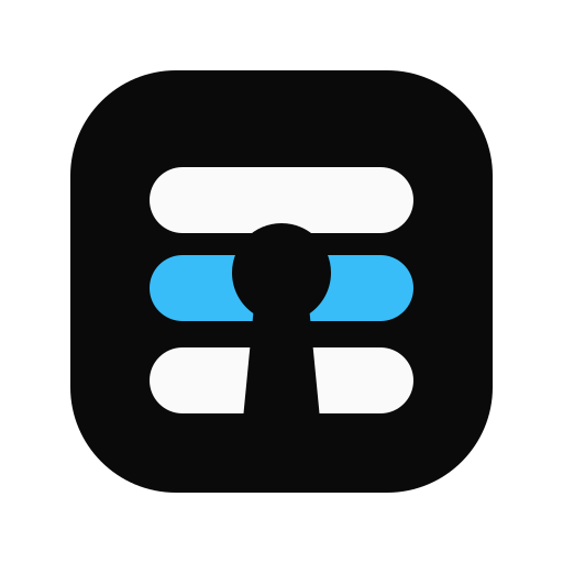
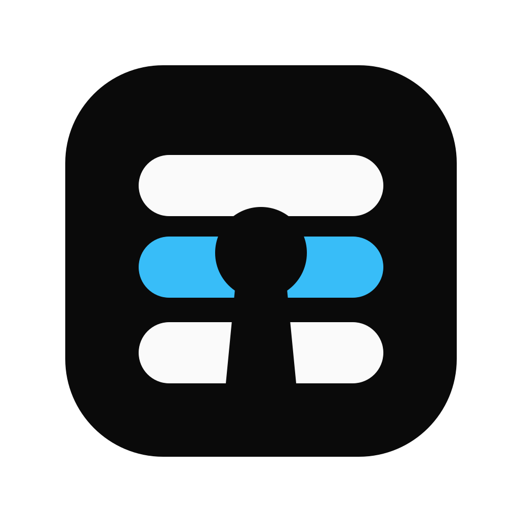
Approved Tinest, Dotweave, Proxer, and Issuary app icons derived from Tinyrack geometry, with generated SVG and PNG downloads.
Use the supplied files as complete artwork. First choose the format and rendered pixel size, then select the product mark. Do not rebuild the geometry from the previews or combine a mark with the Tinyrack wordmark.
Choose a format and pixel size
Prefer SVG whenever the destination accepts it. Choose a PNG that matches the intended rendered size; do not upscale a smaller raster file. The table stays horizontally scrollable within the page on narrow screens.
| File | Use | Guidance |
|---|---|---|
| SVG | Web interfaces and scalable assets | Default choice; one canonical 64×64 vector grid. |
| 16px PNG | Browser favicon | Use only where SVG favicons are unavailable. |
| 32px PNG | High-density favicon and compact lists | Render at 32px or 16px on a 2× display. |
| 48px PNG | Compact lists and shortcuts | Use at the native 48px size. |
| 128px PNG | Service avatars and large lists | Use when the surface requires a raster image. |
| 512px PNG | Large web artwork | Use the launcher-specific files below for installed apps. |
Choose a launcher source
Installed apps need more breathing room than favicons and interface artwork. Use a launcher-icon file for a precomposed icon: it keeps the complete tile inside a 64×64 canvas with 8px of transparent space on every side. For an Android adaptive icon, use the matching adaptive-foreground over a #0a0a0a background. The foreground omits the tile and keeps the glyph inside a centered 54×54 area on Android's 108×108 layer grid.
Keep using the original app-icon files for favicons, service avatars, and web interfaces. On platforms that reject alpha in launcher artwork, let the platform icon generator apply its required opaque background rather than flattening or cropping the source by hand.
 Interface artwork
 Launcher artwork











Product marks


Actual-size previews
Review the four displayed PNG files at their native rendered sizes: 16px, 32px, 48px, and 128px. The downloadable 512px file is intentionally not shown at actual size.
Tinest
 16
16 32
32 48
48 128
128Dotweave
 16
16 32
32 48
48 128
128Proxer
 16
16 32
32 48
48 128
128Issuary
 16
16 32
32 48
48 128
128Surrounding surfaces
The black tile is part of the artwork, so the same asset works on both light and dark interfaces. Keep enough surrounding space for the rounded tile edge to remain visible.
Shared construction
Tinyrack and all four product marks share row bounds from 14.666667 to 49.333333 on the product icons' 64×64 grid, with three 8-unit rows starting at 14.666667, 28, and 41.333333. Product meaning changes only inside that shared silhouette.

Usage rules
Downloads
Each product provides one canonical SVG and five generated PNG sizes. The SVG is the source of truth for every raster download.
The full icon set also ships with @tinyrack/ui. Use the nested brand/apps subpath to import an SVG master or a generated PNG.
import tinestIconUrl from '@tinyrack/ui/brand/apps/tinest-app-icon.svg';
import dotweaveIconUrl from '@tinyrack/ui/brand/apps/dotweave-app-icon.svg';
import proxerIconUrl from '@tinyrack/ui/brand/apps/proxer-app-icon.svg';
import issuaryIconUrl from '@tinyrack/ui/brand/apps/issuary-app-icon-512.png';